Slower than expected progress for the past two weeks (day job and mental health), but:
- Lunar Chippy LLC has now been formed! I am officially a member of the petit bourgeoisie!
- The second progression level is nearly ready to play – there’s a bug with actually showing new buildings in the building menu when you level up, which stops you from actually doing anything with the new content… whoops.
- Once that’s done, I’ll have the 0.4 “Pre-Alpha” build out.
- I’m all signed up for Steam, so I’ll have a Steam page up relatively soon!
For this dev diary, I wanted to talk about the art of the game, and how I use the Minifantasy art assets. As I’ve mentioned before, most of the art isn’t directly created by me. The main exception to that is the trains and train cars, but I’ve aimed for a similar graphical style.
First, what do I mean when I talk about “art assets” and collections of them? In indie game development, it’s really rare for one person to do every single part of the game – people have different strengths and weaknesses, and there’s only so much time anyway. Even if one person does do every component of the game, the engine is usually a product of other people. And even if that one person built their own engine, they didn’t single handedly build the programming language it runs on, or the operating system, computer hardware, etc. The point is, there’s always a question of prioritization: what will I use my time to work on myself, and where will I leverage other people’s work?
This is where art assets come in. There’s quite a few different places online (itch.io, the Unity Asset Store, and Unreal Marketplace are probably the biggest ones) where you can get images, models, sounds, music, and others components made by other people. Sometimes these are free, but often there’s a price, which creates a niche for people to be part of the larger games industry in a way that doesn’t require developing a whole game. Sometimes games that use these assets will get the derogatory label “asset flip” applied to them, implying that some premade assets were slapped together to make a crappy game quickly, but when done well it’s not something that most players will ever notice.
The specific set of assets I use is “Minifantasy” by Krishna Palacio. Many pixel art assets use a 16×16 or 32×32 pixel size for each “block”, and you build your game out of those. Minifantasy, however, is mostly 8×8 pixels – not a lot of space to work with! Despite those constraints, Krishna has created a massive collection of pixel art with a consistent style that matches the aesthetic I wanted for Iron Village.
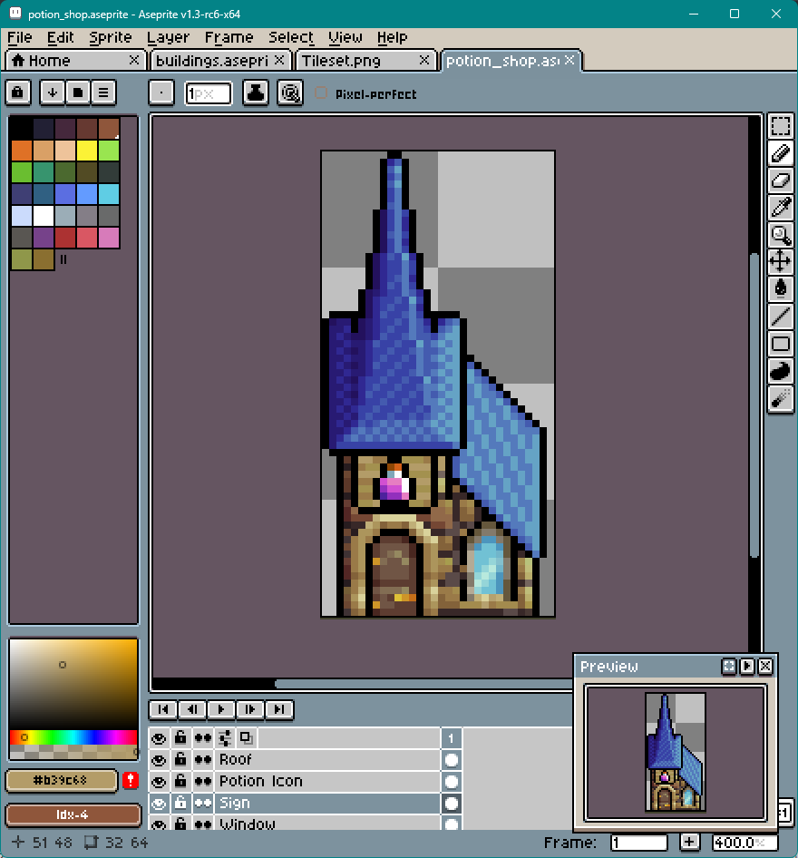
Those of you who have played the prototype may have noticed something though – the grid size the game uses is bigger than the 8×8 pixels of Minifantasy, it’s 32×32. So I’m still involved in making all of the art, it’s just that I’m assembling and editing rather than creating from scratch. Even with the tiny size of the Minifantasy assets, I usually find myself trying to squeeze in more than would normally fit. For example, here’s the potion shop that I recently made:

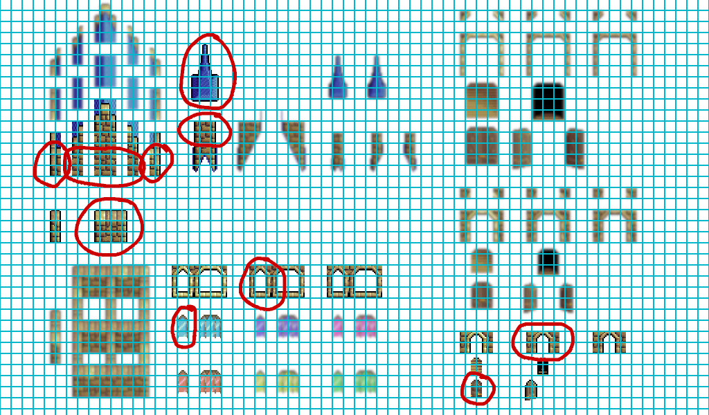
And here’s the specific parts of the “Wizard School” Minifantasy pack I used:

You’ll notice that as is, they wouldn’t fit within the 32 pixel width, or the height limits I set. Theoretically the height could be unbounded, but this would block too much of the buildings behind it. That doesn’t stop me from squeezing things together (for instance, fitting in windows and doors near edges of the building), but it does mean I have to go in and figure out the “why” for each individual pixel: Is this part of a brick? What direction is the lighting coming from? How can I make the ledge smaller while keeping it as a clearly distinguishable ledge? There’s a lot of iteration in this process to get something that looks good in the end.
Hopefully that sheds some light on the process I use to make the building art. The plan is to have 0.4 out for the next dev diary, along with a rough (rail)road map to release.

Leave a Reply